
COLOR THEORY FOR BRANDS
Color isn’t decoration. It’s a system that shapes perception, builds trust, and drives action.

Color is one of the first decisions your audience makes about your brand
Before they read your headline. Before they understand your offer. Before they take action.
They feel something.
That feeling comes from color.
Most businesses treat color like a finishing touch. Something to “make it look good.” But when color is chosen without structure or intention, it creates inconsistency, weakens trust, and quietly impacts performance.
At Chris Eder Design, color is treated as a system. One that supports clarity, reinforces identity, and guides users toward action.
WHY COLOR IS A BUSINESS DECISION
Emotion, clarity, and perception happen before content is processed. Color influences how your audience interprets everything that follows.

First impressions
Emotional response
Readability and accessibility
Brand recognition
User behavior
This isn’t subjective. It’s behavioral.
THE STRATEGIC COLOR SYSTEM
Strong brands don’t choose colors. They define how color works.
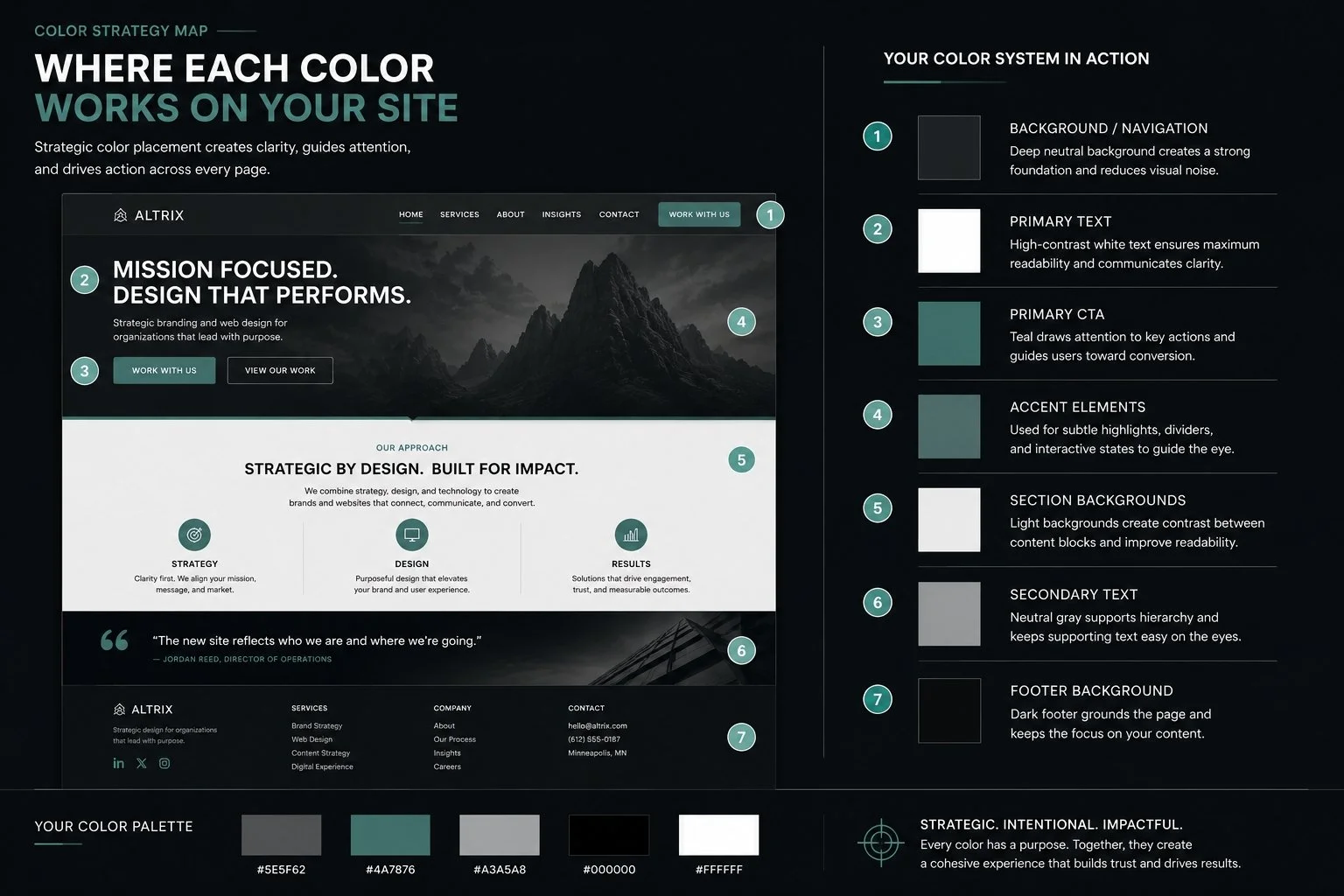
A strategic color system includes clearly defined roles:
Primary Color
Your foundation. Used consistently across core elements.
Secondary Colors
Support structure and add depth without competing.
Accent Color
Used intentionally to guide attention and highlight action.
Neutral Colors
Provide balance, readability, and spacing.
Each color has a job.
When everything has a job, nothing competes.