Why Color Is a Strategic Asset, Not a Style Choice
Most businesses treat color like decoration.
They pick a palette because it feels modern, trendy, calming, masculine, luxurious, earthy, or bold. The problem is that color does far more than make a website look good. It influences how people interpret trust, professionalism, clarity, emotion, and usability before they read a single word.
That means color is not a style decision.
It’s a business decision.
Color Speaks Before Content Does
When someone lands on your website, their brain is already making decisions within seconds.
Does this business feel trustworthy?
Does it feel organized?
Does it feel premium?
Does it feel overwhelming?
Can I quickly understand what matters here?
Color plays a major role in all of it.
A law firm using bright neon colors might unintentionally feel less established. A wellness brand using harsh contrast and aggressive reds may create anxiety instead of calm. A restaurant with poor text contrast may frustrate users before they ever look at the menu.
The reality is simple: color shapes perception faster than copy ever can.
That’s why strategic brands build systems, not palettes.
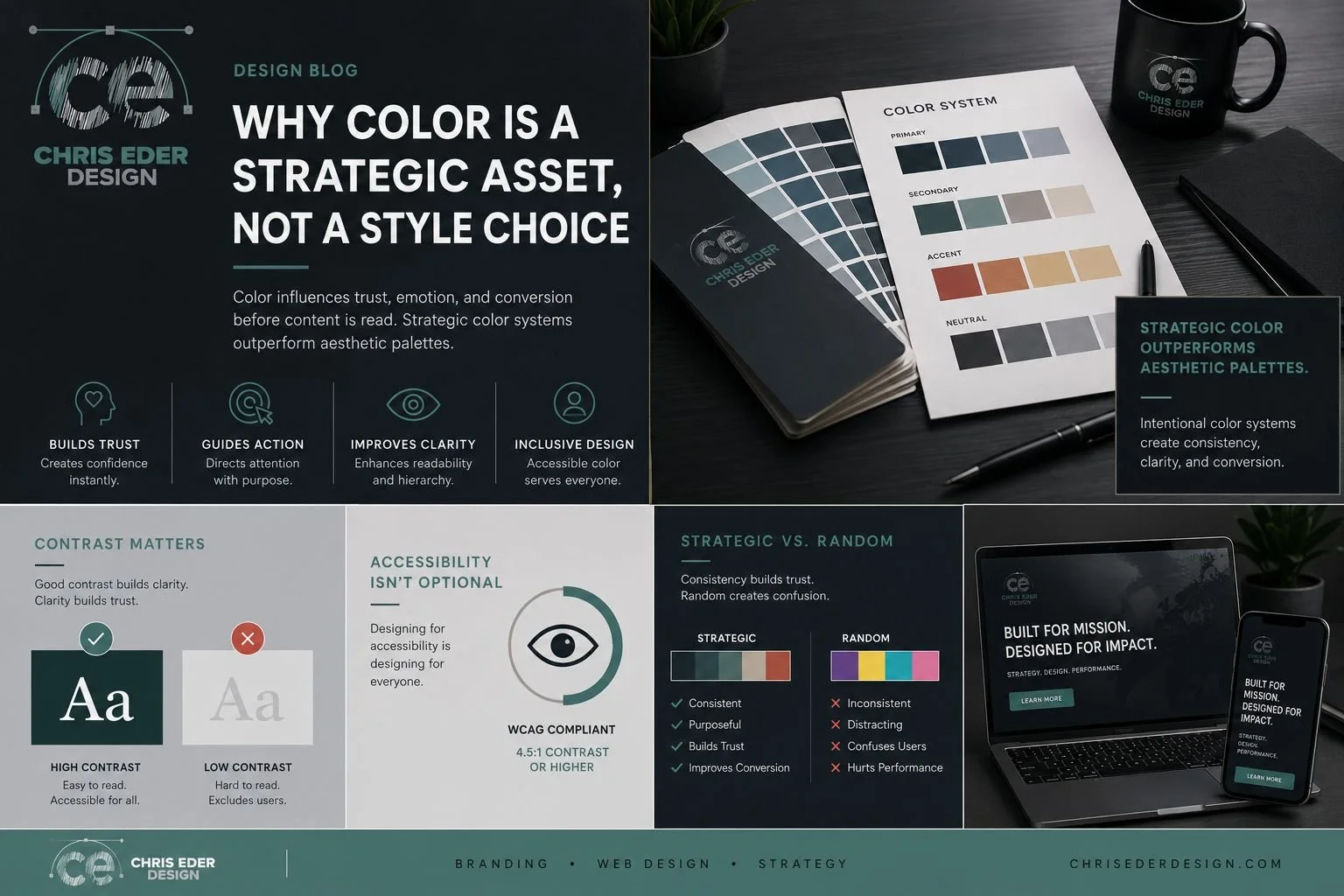
Strategic Color Systems Create Consistency
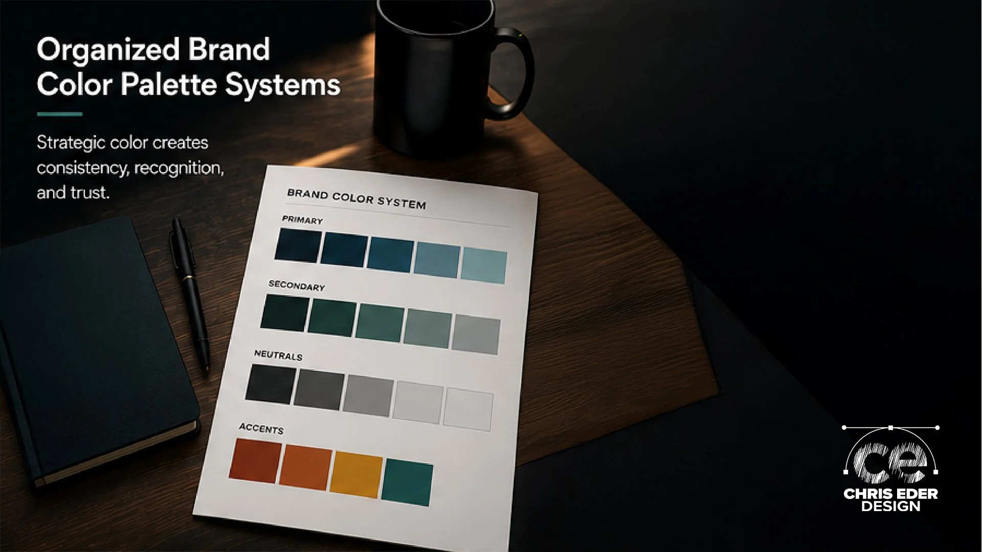
Strong brands don’t just choose colors. They define the purpose behind every color.
At Chris Eder Design, color is usually assigned roles like:
Primary brand identity
Calls to action
Background environments
Typography hierarchy
Emotional framing
Accessibility support
Visual pacing
User guidance
This creates consistency across every page, social graphic, landing page, and marketing asset.
When color is inconsistent, users feel it immediately, even if they can’t explain why.
Buttons compete for attention. Important information disappears. Visual hierarchy breaks down. The brand starts feeling less trustworthy because nothing feels intentional.
Consistency builds familiarity. Familiarity builds trust.
That trust directly impacts conversions.
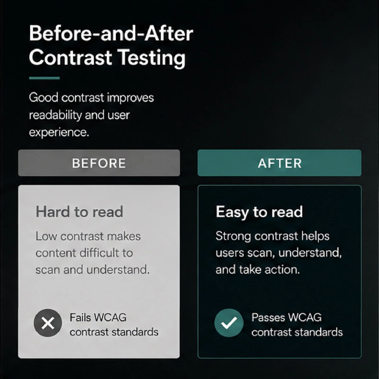
Accessibility Is Part of Good Branding
One of the biggest mistakes businesses make is choosing colors that look good in a mockup but fail in real-world use.
Low contrast text. Light gray fonts on white backgrounds. Thin typography over imagery. Buttons that disappear on mobile.
These decisions hurt usability and accessibility.
Good color systems account for:
Contrast ratios
Readability
Mobile viewing
Aging eyes
Outdoor viewing conditions
Visual fatigue
Color blindness considerations
Accessibility is not separate from branding.
It is branding.
A website that people struggle to read creates friction. Friction creates abandonment.
Emotion Matters, But Clarity Wins
Yes, colors carry emotional associations.
Blue often communicates trust and stability. Green is tied to growth and balance. Black can create sophistication and authority.
But context matters more than internet color psychology charts.
A tactical military readiness platform should not feel like a children’s toy. A trauma-informed wellness brand should not feel cold and clinical. A brewery should not feel sterile.
The right palette supports the mission of the brand while maintaining clarity and usability.
That balance matters more than trends.
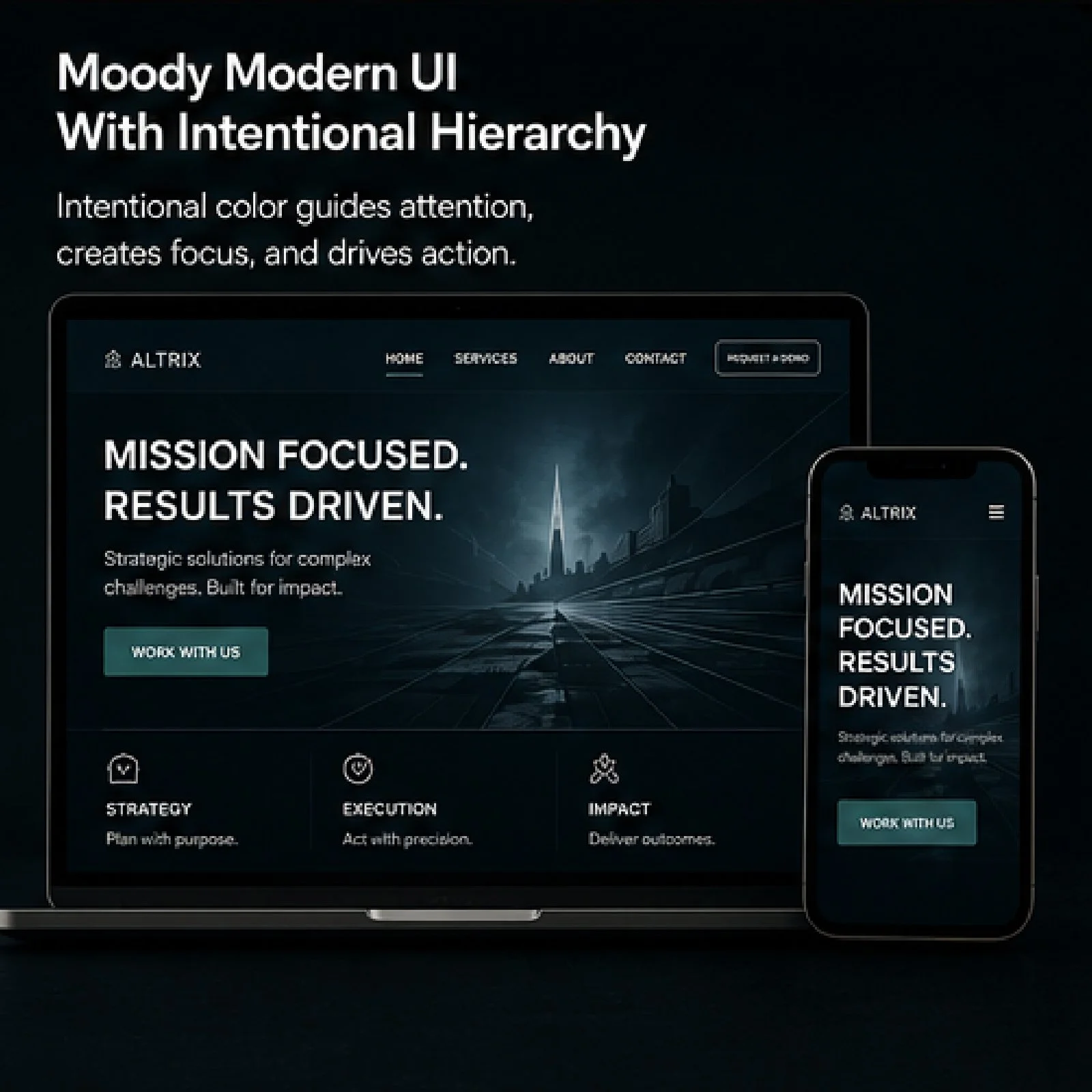
Color Impacts Conversion More Than Most Businesses Realize
Here’s the thing most people miss:
Good color systems quietly improve performance.
Strategic contrast improves button visibility.
Consistent visual hierarchy improves scanning behavior.
Intentional accents guide users toward action.
Balanced palettes reduce overwhelm.
Accessible typography increases engagement time.
Color affects how users move through a website.
That movement affects conversions.
The businesses seeing the strongest results usually aren’t using more colors. They’re using fewer colors more intentionally.
Aesthetic Branding vs Strategic Branding
Aesthetic branding focuses on appearance.
Strategic branding focuses on communication.
The difference matters.
A beautiful website that confuses users will underperform every time. A visually restrained website with strong hierarchy, accessibility, and intentional color usage will almost always outperform trend-driven design.
That’s because effective branding is not about personal taste.
It’s about helping the right audience feel confident enough to take action.
Final Thoughts
Color is one of the most powerful tools in branding and web design, but only when it’s treated as part of a larger strategy.
When businesses approach color intentionally, everything improves:
Brand recognition
User trust
Readability
Emotional alignment
Accessibility
Conversion performance
Good color systems don’t scream for attention.
They quietly guide people exactly where they need to go.