The Psychology of Color in Branding and Web Design - Why People Feel Your Brand Before They Understand It

Color shapes perception long before a visitor reads your message.
Most business owners spend a great deal of time thinking about what they want to say.
Far fewer spend time thinking about what their audience feels before they say it.
That feeling matters.
Long before a visitor reads a headline, evaluates a service, or clicks a button, they are already forming impressions based on visual cues. One of the strongest and fastest of those cues is color.
Color influences how people perceive trust, confidence, energy, professionalism, and credibility. It helps establish expectations and creates emotional context for everything that follows.
This is why color is far more than a design decision.
It's a communication tool.
At Chris Eder Design, color is approached strategically because the way people feel about your brand influences what they do next.
Color Creates Emotional Context
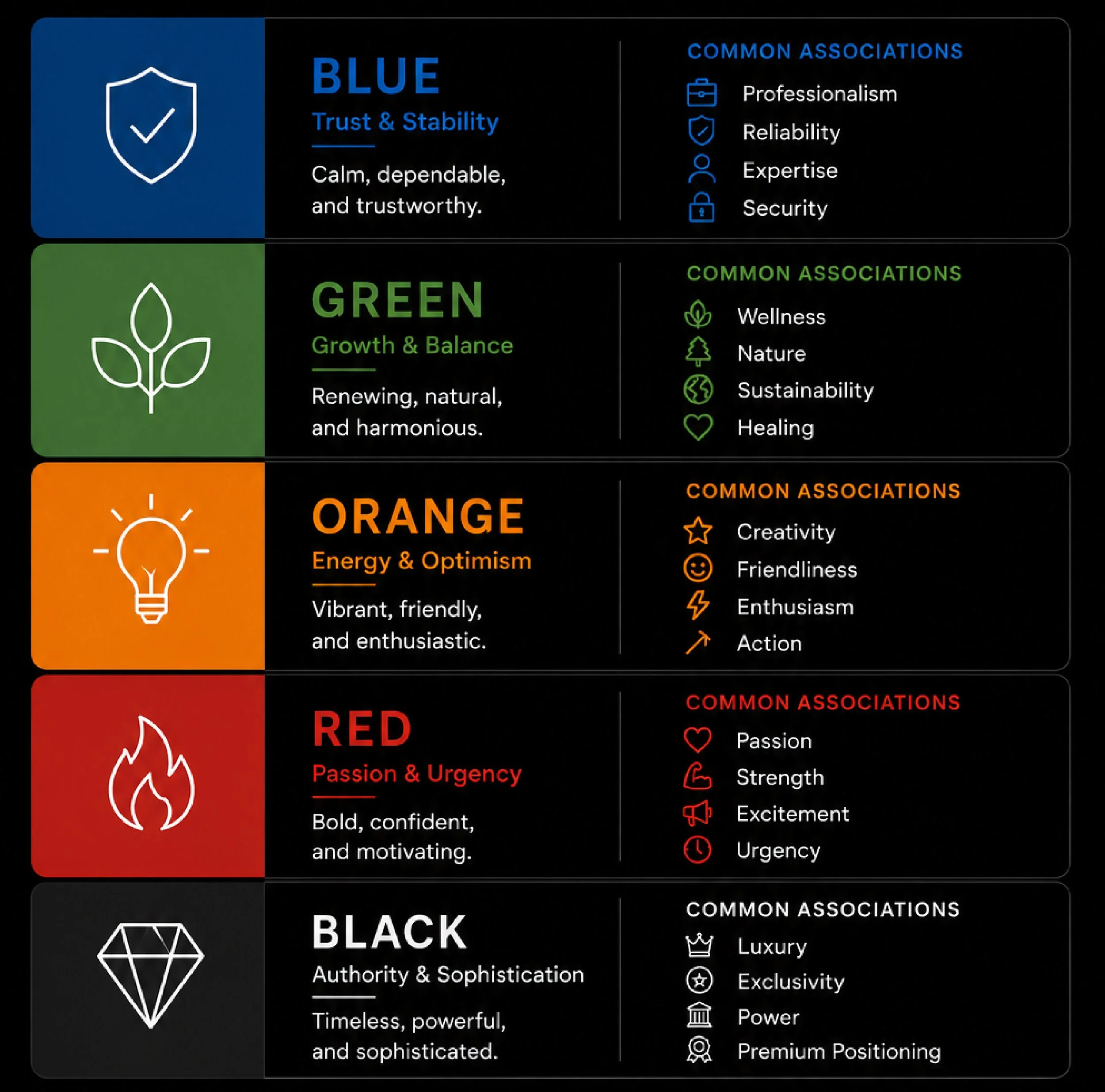
Every brand wants to evoke a particular response. Some brands want to feel dependable and trustworthy. Others want to feel innovative and energetic. Some aim for calm, balance, and stability. Color helps establish these expectations immediately. However, color psychology is often oversimplified.
You've probably seen lists claiming:
Blue means trust
Green means growth
Red means urgency
While there is some truth behind these associations, context matters far more than individual colors.
A deep navy blue used by a financial institution communicates something very different than a bright electric blue used by a technology startup.
The emotional impact comes from the complete system, not a single color swatch.
Why Color Influences Trust
Trust is one of the most valuable assets any brand can earn. Visitors constantly evaluate whether a business feels credible. Color plays a surprisingly important role in that assessment.
Strategic color systems communicate:
Consistency
Professionalism
Stability
Intentionality
Inconsistent color usage often has the opposite effect.
A website that uses multiple competing colors, lacks hierarchy, or changes visual direction from page to page can feel disorganized even when the content is strong.
People may not consciously identify the problem.
They simply feel less confident.
Trust is emotional before it becomes logical.
Color and First Impressions
Research consistently shows that users form opinions about websites within seconds.

Those first impressions are heavily visual.
Color contributes to:
Perceived quality
Professionalism
Brand personality
Ease of use
This is one reason why strong brands often feel recognizable before their logo even appears.
The color system itself becomes part of the identity.
Think about some of the most recognizable brands in the world.
Their color systems are not accidental.
They are assets.
Color Helps Users Make Decisions
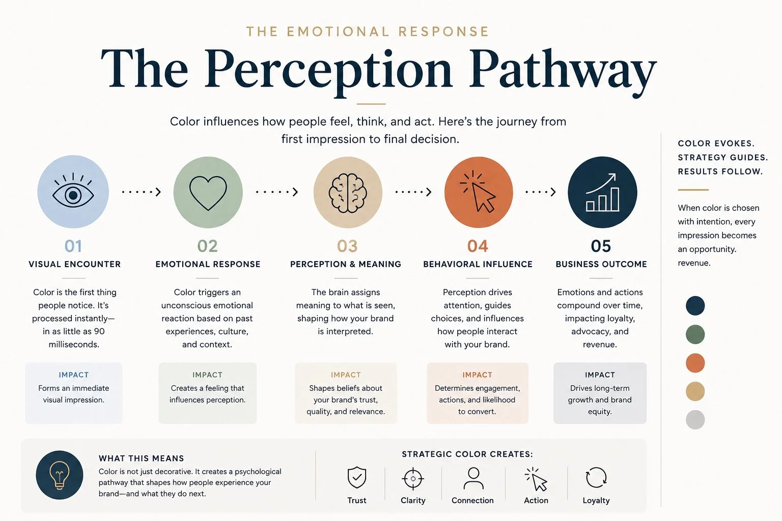
Color doesn't just influence emotion.
It influences behavior.
Strategic color systems guide users by helping them understand:
What is important
What should be read first
What action should be taken next
This is where color and conversion become closely connected.
A well-defined accent color can:
Draw attention to calls to action
Improve visual hierarchy
Reduce decision fatigue
The goal isn't to make everything stand out. The goal is to make the right things stand out. When color supports decision-making, users move through a website with greater confidence.
Emotional Consistency Matters
One of the biggest mistakes businesses make is creating emotional inconsistency. Their brand message says one thing. Their visual presentation says something else. For example:
A business that positions itself as professional and dependable but uses an overly playful color system creates friction.
A wellness brand that wants to feel calming but relies on aggressive visual contrast creates tension.
A luxury brand that uses inconsistent colors may appear less refined than intended.
The strongest brands align their colors with their mission, audience, and positioning.
Consistency reinforces trust.
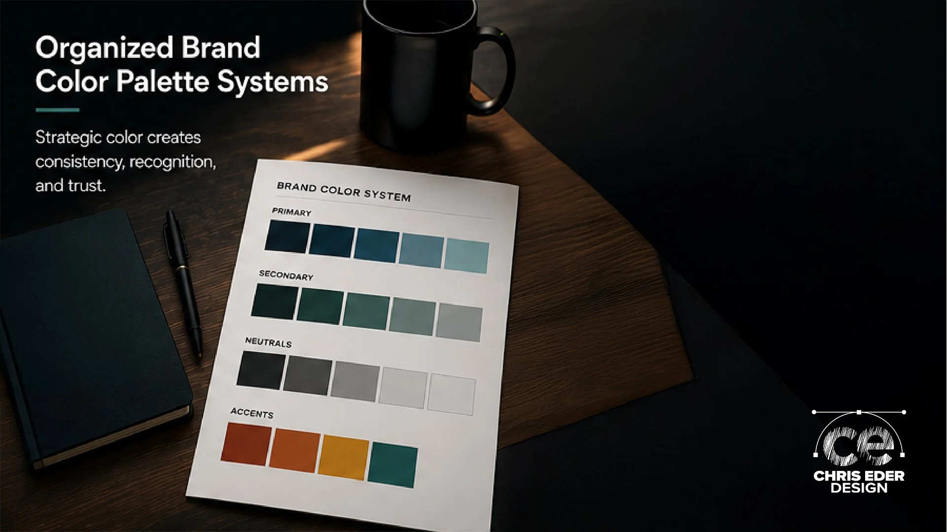
Color on Squarespace
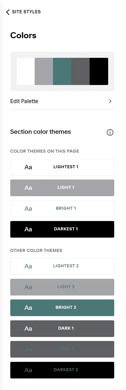
As a Squarespace Gold Partner, one of the most common issues I see is not poor color selection. It's a poor color implementation. Businesses often choose good colors but fail to create a system around them.
Squarespace makes it easy to establish:
Primary brand colors
Supporting secondary colors
Accent colors
Neutral foundations
When these roles are clearly defined, every page feels cohesive.
The result is a website that feels intentional instead of improvised.
The platform supports the system.
The system supports the experience.
The Real Goal of Color Psychology
Color psychology is not about manipulating users. It's about reducing friction. It's about creating an environment that feels aligned with your message and easy to navigate. When users feel comfortable, they stay longer. When they stay longer, they learn more. When they learn more, they are more likely to trust you. Color is one of the simplest tools available for creating that experience.
Final Thoughts
The psychology of color is not about finding the perfect shade of blue or green. It's about understanding how color contributes to perception, trust, and behavior.
Strategic color systems:
Create emotional alignment
Improve recognition
Support usability
Strengthen conversion pathways
When color is approached intentionally, it becomes far more than decoration. It becomes part of the strategy.
Build a Color System That Supports Your Brand
If your website feels inconsistent or your brand isn't communicating the right message, color may be part of the problem.
A strategic color system can help create clarity, consistency, and confidence.
Start a conversation with Chris Eder Design and build a brand that performs with purpose.